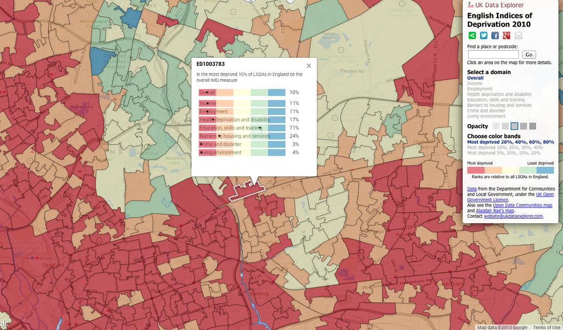
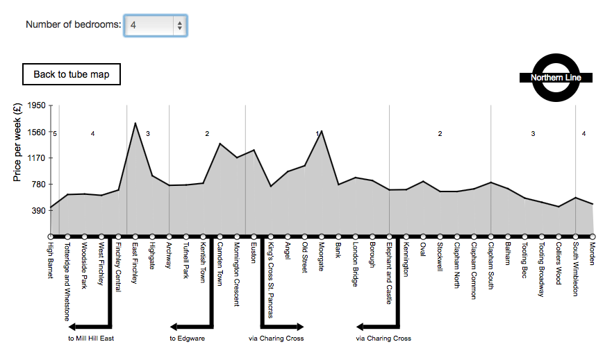
Census Data for the UK can now be easily searched, with the user-friendly UK Data Explorer. Decide on the region you want to investigate and then you can click on a range of different indicators. This first image is a screen shot from the Deprivation in London map. The focus is on Barking, the place I was born, the red areas are most deprived and blue least deprived. For each small area or Lower Super Output Area (LSOA) a pop-up data box shows specific deprivation information. Barking is one of the most deprived areas in London. If you travel west to Stratford, does the amount of LSOA's shaded red reduce or increase? 
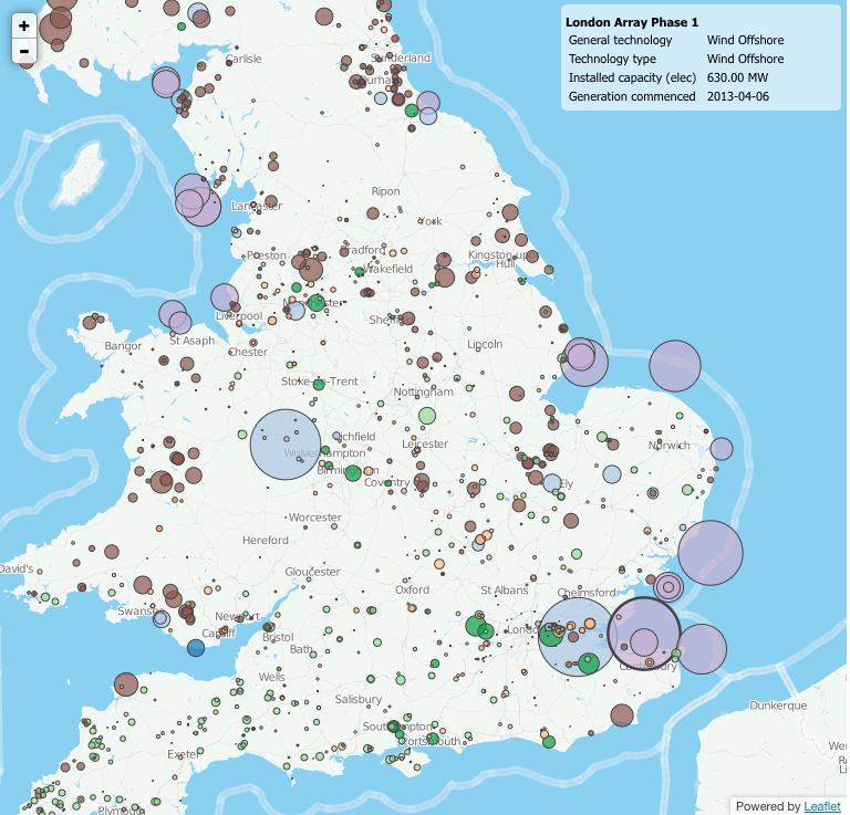
This map is looking at Renewable energy generation (link here) and is a great map to use whilst studying the energy mix of the UK. Individual schemes with their generation capacity can be investigated.
0 Comments
If you are curious to see what the price of renting in London is, then this is a very useful Interactive Map - link here. The property rental service Find Property have used their database to calculate and display the average rental cost for homes within a kilometre of each tube station in the capital. Click on a tube line and a neat graph shows the average cost of property appears. The data displayed can be organised according to the number of bedrooms. The two following graphs show the Northern line, the cost of one-bedroom properties rising from approximately £200 a week in Zone 4 up to £510 a week in Zone 1. Source: Find Property The pattern for four-bedroom properties shows sharp spikes at £1684 in East Finchley and £1567 at Moorgate. As the data is updated in real time, if there are no properties for rent, the location will show as £0
Discussion: 1. What does this Interactive tell you about the costs of renting in the capital? 2. What factors might cause the variation in rental prices across the capital? 3. Would you spend more on property rentals and live centrally or would you choose to live further out and commute to work if you had the choice? Migration patterns have been represented in a dramatically different data visualisation called peoplemovin (link here) by Carlo Zapponi - shared on twitter by @MattPodbury
The title of this blog is an extract from the tearful plea spoken by the Philippines delegate at the beginning of the UN climate talks in Warsaw. UN negotiations in Warsaw must deliver action on climate change, as business as usual policies are not cutting soaring carbon emissions. The Philippines government have linked climate change to the recent super Typhoon Haiyan and they urge governments meeting in Poland to take action to resolve the deadlocked climate talks. Yeb Sano in his tearful plea to in Warsaw spoke eloquently about the plight of people in his country, his family who come from Tacloban are alive, but had not eaten for the first three days after the disaster. Yeb Sano then went on to describe the two-week climate conference: "This process has been called a farce, it has been called an annual carbon-intensive gathering of useless frequent fliers, it has also been calling saving tomorrow today" At the time of writing there had already been 500 000 views on You Tube - Watch the emotional plea for yourself - link below. Find out more about this story from the Guardian website - link here. Flightradar24.com is a flight tracker that shows live air traffic from around the world. This is a super way of seeing where tourists travel to and from and where the busiest airport hubs are around the world. Dubai had 16 aircraft on the ground when I took the screenshot below, for comparison, there were two in Abu Dhabi. Globally there were 6,716 aircraft recorded flying around the world. Not all aircraft can send data - so coverage is around 60 per cent. Aircraft are geolocated using GPS and mapped live. How many planes are flying around the world now? Which are the busiest transport hubs? Why are so many people on the move? Do you ever wander what travellers can see out of their window? with thanks to @MissKLeak for highlighting this website
Typhoon Haiyan, one of the strongest storms ever recorded, has struck the Philippines, video here. Haiyan was named by the World Meteorological Organization - it means 'petrel'- a type of seabird, in Chinese, although it is locally known as Yolanda. Typhoon Haiyan has ripped apart buildings and triggered landslides across the country, leaving an estimated 10,000 dead in Tacloban. The death toll has remained fairly low due to the widespread evacuation which took place. Find out how a tropical cyclone forms here. The BBC published the predicted path of the super typhoon and predict that the typhoon will hit Vietnam over the weekend. The BBC have a short video clip on their website - link here and here. The Weather channel (link here) have said that Typhoon Haiyan has sustained winds at up to 150 miles per hour, with gusts of 235 mph when it made landfall at Eastern Samar province's Guiuan township on Friday 8th November 2013. These wind strength makes it equivalent to a Category 5 hurricane.
The Philippines is a vulnerable country with thousands of islands spread across a tropical ocean. Although the population are only concentrated on 11 islands, they often find themselves in the path of typhoons. The population have a low GDP of $2587 per capita (2012) and authorities have warned dozens of provinces across the country to be prepared for possible flash floods and landslides. According to CNN (report here) some of the most vulnerable people are those living in temporary shelters after the recent 7.1 magnitude earthquake displaced around a third of a million people from their homes on the central Philippine island of Bohol. Around 125,000 people have been moved to evacuation centres for safety. The interactive map on the World Bank website can be used to access a wealth of Open Data about development in countries around the globe. With a GDP of $8.358 trillion China is now classed as an upper middle income country. The map below shows what development projects are taking place and more can be found out with a click of a button. Year 13 students can use this to understand how China is developing and how peoples' quality of life might improve across the country. If you focus in on an area, for example around the area of Harbin, you can see geographical patterns to the type of projects taking place. The $200 million JiTuHun Railway project, connecting the cities of Jilin and Hunchun in Jilin province with a double line track capable of supporting trains running at 250 km/h, stands out as a linear series of orange symbols.
What other patterns can be seen in the data? Where are similar projects taking place? Are the types of project related to the population density in an area? National Geographic have produced a map of how the planet would look after all the ice has melted and drained into the sea, sea levels some 66 metres higher than today! Some countries would be more affected than others. Bangladesh would almost disappear and the number of environmental migrants from this one nation could be as high as 160 million. Bangladesh would almost disappear and the number of environmental migrants from this one nation could be as high as 160 million.
NOAA View is a newly published and useful portal to maps of NOAA data from a variety of satellite, model, and other analysis sources. An example of where such a resource could be used is for students to look up the global variation in precipitation data for August 2004, as a starter activity, before studying the Boscastle floods. The screenshot above shows this map and the Image portal instruction box.
NOAA View has been created as an education and outreach tool, and will be valuable to show changing climate, air, oceans land and ice conditions through time. AS students might want to look at the variation in ocean temperatures for El Nino and La Nina years.This image is for the ocean surface temperatures in September 1997, the strongest strongest event ever recorded. A nice feature of this data imagery is that the map is moveable, so that the Pacific Ocean can be centrally located. |