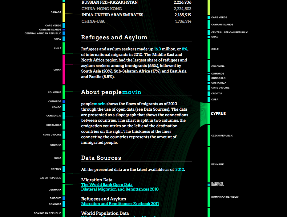
Migration patterns have been represented in a dramatically different data visualisation called peoplemovin (link here) by Carlo Zapponi - shared on twitter by @MattPodbury
| BSAK Geography |
|
Migration patterns have been represented in a dramatically different data visualisation called peoplemovin (link here) by Carlo Zapponi - shared on twitter by @MattPodbury
1 Comment
11/18/2013 12:59:51 am
Hi Leave a Reply. | Geography blogThese blog posts are written by Emma Rawlings Smith, the Head of Geography at the British School Al Khubairat, Abu Dhabi and they look at geographical stories currently in the news ArchivesMarch 2014 CategoriesAll |
 RSS Feed