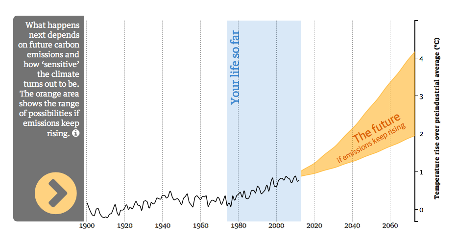
The Guardian have published a rather nice interactive (link here), where you can see how temperature will rise in your lifetime. The graph above shows how hot it will get in my lifetime. The last decade was 0.6 degrees warmer than the decade before I was born. The data is provided by the Environmental Change Institute, University of Oxford, the Interactive by Richard Millar
 RSS Feed